Posts

Showing posts from February, 2020

Comparison Between Tatler and Reveal

Similarities aimed at women Both covers have narratives on the cover Both titles suggest a secret information Use capital letters for heading Cover lines and Central image summaries the content Limited colour scheme Differences : Tatler Main cover image ( Studio Photography ) Target audience - Wealthy women Makes the celebrity look good  No price notification on the front cover Content - 'parties' , 'Sloanes' , ' Gap year '  Language - Formal ( specialised to a target a specific audience ) Average age of readership - 41 ABC1 Audience - 83% typography - serif cover lines - sans serif Differences : Reveal Several images  Paparazzi shots/ images of celebrities not looking their best  Indirect mode of address price notification - prince 99p top left corner celebrity relationship gossips , diets , beauty , motherhood informal and friendly emotive language   typography - majority sans serif  average age of readership - 28 ABC1 A
Talter : Blog Task Case Study ( Extension )

Grade 8/9 extension tasks 1) Are there any misrepresentations or under-representations of groups? What might this suggest about the target audience? The target audience is rich people who own business or designer companies. 2) How does the front cover engage audiences with possible narratives? Look for stories, cliffhangers, dramatic cover lines etc. The front cover engages the reader as they have short and snappy cover lines to make the reader more suspicious on what happens next.  The statement ' The one month gap year ' makes the reader feel left out. Also, ' the new accessories' makes the reader feel as if they need the accessories, so they make the reader feel greedy for the product. The story about the LA life emphasises on the reader wants to know more. This  shows the  magazine company makes it dramatic for the reader. 3) What does the costume and make-up in the central image suggest about the character featured on the front cover of the April 2017 edition

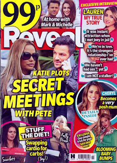
Reveal : Blog Task Cask Study ( Extension )

Grade 8/9 extension tasks 1) How does the front cover engage audiences with possible narratives? Look for stories, cliffhangers, dramatic cover lines etc. The front cover engages the reader as the top right corner has a narrative about Lauren. About the cover lines they create issues and problems for the reader as the main flash is about Katie Pitch having the secret meetings with Pete. Also shows mother hood as the cover lines state ' posh mum '  and  ' Baby Bumps '. It also shows the magazine the skin care product cannot be bought from anywhere else because I can make the inference from the word ' Exclusive '. 2) What are paparazzi images and why are they crucial to the front cover of Reveal?  The reader can clearly analyse the magazine and can identify the image as a paparazzi image. This is because the model or celebrity is not facing the camera. In addition, the model or celebrity will be minding their own business ,a person who sees them in the stree

Reveal: case study blog task

Image
Media language 1) How many of the 12 magazine cover key conventions feature on this edition of Reveal?  - Main flash ( '' Katie plots secret meetings with Pete ) - Headline (''Reveal'') - Exclusive ( can't get it in any other magazine ) - Sans Serif ( Majority of the cover lines are in sans serif fonts) - studio photography ( top right hand corner ) - Colour scheme ( usage of very bright colours ) - Price ( the price is more appealing then the headline. This implies that the reveal magazine is way cheaper then the Tatler)    2)  What is the font choice used on the cover and what does this choice connote?  The font used on this magazine is sans serif - majority. they use low vocabulary, also known as low brow and also implies it is aimed a less educated and lower class people. however in the bottom part of the magazine they used handwritten fonts for the celebrities names. this also demonstrates the informal and slang language.